 Disney Tips Your Guide To A Great Disney Vacation
Amongst Disney Parks fans, there’s a fandom for everything – attractions, characters, merchandise, food, you name it. The poster art of the Disney Parks is no exception.
These gorgeous coming attraction posters found near the front of the Parks – especially in Disneyland and the Magic Kingdom – work to whet Guests’ appetites for the experiences to come while also serving as pieces of beautiful pop culture artwork and graphic design in their own right.
It’s no surprise, then, that Disney has published two editions of a popular book dedicated to these Disney Park posters – Danny Handke and Vanessa Hunt’s Poster Art of the Disney Parks.
We can’t recommend this book and its stunning reproduction of Disney Parks poster art highly enough, which is why we’ve pored through its pages (and done a bit of internet searching) to bring you our top 10 list of the best Walt Disney World posters!

Credit: Disney Parks Blog
NOTE: We’ve limited ourselves to the Florida Parks just to keep the potential pool of beautiful posters merely imposing to choose between, as opposed to flat-out impossible!
#10 – The Crystal Palace
This one rates pretty low on the list because, c’mon, it’s a poster for a restaurant . . . but it sure is a pretty poster for a restaurant. The line work that captures the intricate details of the modernist eatery truly makes it look like a palace, and though it may not make your mouth water, it definitely turns the Crystal Palace into a locale that warrants a visit for the architecture alone.

Credit: Disney
RELATED: Then & Now: Disney’s Great Movie Ride and Mickey & Minnie’s Runaway Railway
#9 – The Great Movie Ride
An attraction based on the greatest moments in cinema demands a poster that evokes the best of movie-going, and the poster for the Great Movie Ride comes close to doing just that. With its representation of the classic characters Guests will encounter, the central, mysterious light drawing the eye onward, and the clear, readable text inviting us “INTO the movies,” the only thing that holds this poster back is its far-too-accurate representation of the clunky ride vehicle that, from any angle, is a bit of an eyesore.
#8 – Splash Mountain
Yes, the characters this poster captures are problematic, at best, but there’s no denying the power of this imagery. Combining the kinetic movement of the splashing log with the cartoonish characters and a physical representation of the titular mountain, Larry Nikolai’s Splash Mountain poster stands out as an eye-catcher by appearing to be a poster for an actual film and not “just” an attraction.

Credit: Disney
RELATED: The Real – and Alarming – Reason Behind Splash Mountain’s Overhaul
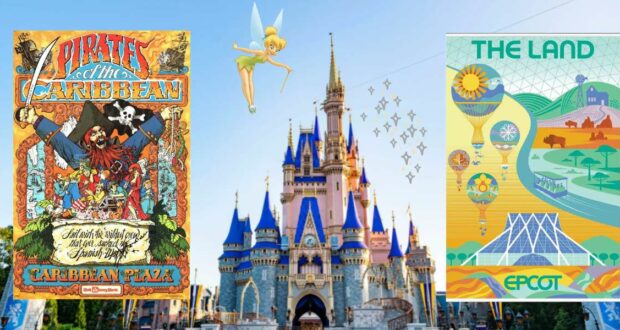
#7 – The Land
This poster for EPCOT’s The Land really stands out for its subtlety, allowing shading and color to do the work of drawing in the eye rather than trying to capture one exciting or splashy moment. Instead, we get the sense of what this pavilion truly represents – something quieter, more meditative, and representative of the ecology of the real world around us.
#6 – Countdown to Extinction
Though the name of this attraction may have changed, the power of this poster for Countdown to Extinction is undeniable. The cute, cartoony version of Mickey coming face-to-face with a more realistic – and utterly terrifying – carnosaur really gets at the heart of how startling and scary this ride can get. Poor Mickey!

Credit: Disney
RELATED: 5 Disney Lands That Went Extinct Way Before DinoLand U.S.A.
#5 – Tomorrowland
With its tagline stating that “The future that never was . . . is finally here!”, George Stokes and Anne Tryba’s poster for the mid-90s Tomorrowland redo evokes a gorgeous neo-futurist vision of the land’s redesigned architecture. If only the attractions added to the land in the coming years had stayed true to this mission statement, perhaps we could still be living in that future that never was today!
#4 – The Pirates of the Caribbean
It might be a bit busy, but talk about fun! Jim Michaelson’s cartoonish poster for Walt Disney World’s version of the Pirates of the Caribbean is a crazy, kaleidoscopic montage of the many rascals and rapscallions to be found on the ride. It does the hard work to transform potentially menacing pirates into a band of “bad boys” we can root for thanks to the innocent style with which their antics are represented.

Credit: Disney
RELATED: Which of Disney’s 5 Pirates of the Caribbean Attractions Is Best?
#3 – Walt Disney World Railroad
Though the Walt Disney World Railroad may not be the most exciting attraction in the Magic Kingdom, it nevertheless rates one of the most exciting posters. Adapted from the Disneyland Railroad poster by Jim Michaelson, Ernie Prinzhor, and Rudy Lord, the poster for the Walt Disney World Railroad features a kinetic use of font to draw Guests’ eyes and turn what could otherwise feel like “just” a train ride into a must-do attraction.
#2 – Spaceship Earth/EPCOT
Designer Norm Inouye’s pre-opening peak at the grandeur and mystery of Spaceship Earth still gives us chills to this day, especially when that stark image is juxtaposed with the spectacular tagline, “The 21st century beings October 1, 1982.” The almost eerie science fiction tone of this poster clearly indicated that EPCOT – as represented by its central attraction, inside the park’s icon, Spaceship Earth – would have a completely different tone than the whimsical Magic Kingdom, and thus it served as the perfect “coming attraction.”

Credit: Disney
RELATED: What Is EPCOT, Anyway?
#1 – The Haunted Mansion
Come on, they don’t get more classic than this! The spooky atmosphere, ghoulish green hue, offset creepy mansion, and, of course, three mischievous hitchhiking ghosts make this (another clone from the Disneyland version, by Ken Chapman and Marc Davis) the top Disney Parks poster. It perfectly captures the tone of the ride – light spooks with a sense of humor, but nothing too scary – and gets us eager to hop on board a Doom Buggy to once more experience the wall-to-wall creeps and hot and cold running chills!